Stumble Guys is a AAA cross-platform Game where you compete against 31 other players in 3 round games to see who is crowned the winner.
· Role: Level Designer
· Genre: Platform, 3D Platforming, Shooter, Driving
· Level's Team Size: 9
· Tools Used: Unity 3D, Excel, Jira, Confluence, Miro
In Stumble Guys I was the sole Design owner of the Levels we made as a team.
I also metored the less experienced Level Designers in the Game.
• Design owner for: Treasure Island, Space Drop & all the MrBeast Levels
• Mentoring
• IP Communications
As the sole Design owner of my levels, I executed on the vision given by the Game Director from concept to final product, designing an experience that best fit the specifications given. Additionally, I also set the visual direction the level should follow, relying on the Concept Artist's opinion and skills to polish the direction and give it depth.
In my time as a design owner, I made decisions based on user data, team health, player and peer feedback to achieve excellence of the product we were developing as a team. This was done whilst allowing each member to feel heard, with weight on the team and having a sense that what we were aiming for was achievable.
.
Beast 1 and 3, fell right during vacation period, therefore the scopes had to be tight whilst delivering a proper quality product; up to the standard of a collaboration of this caliber.
There are two main reasons that ruled how I decided the scope of the First Beast level. Firstly, the level had to be welcoming to a lot of new players, so I should go for a level with simple mechanics so it can be a great introductory step into our game. Secondly, the team had just wrapped up Turbo Temple and at the later stages of its development, the team health had taken a toll (which was reflected on a Team Health graph we update on Miro every sprint closure).
With both of these things on mind, I settled to make a simple yet solid level. Using already existing elements, with small twists and variance to make the level feel unique, whilst not creating a massive amount of workload for the team.
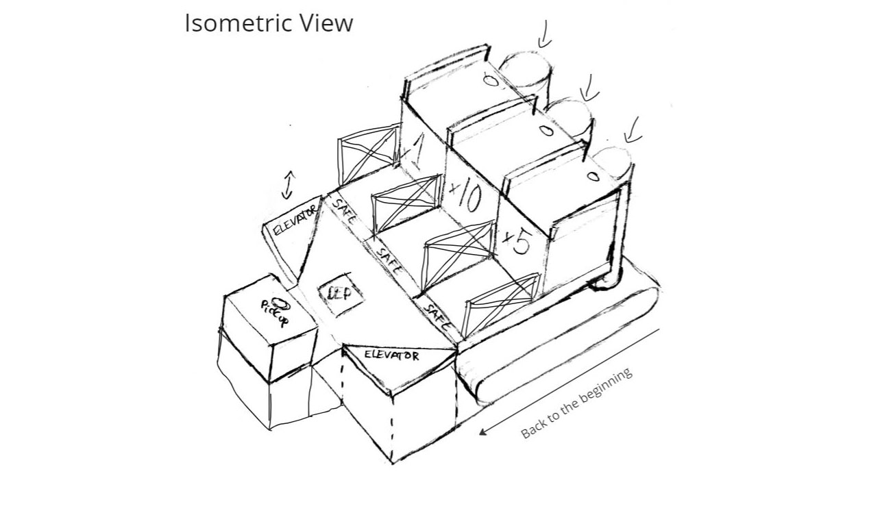
The direction I went for was a level that had a lot of different paths, the aim of which were to segment players based on difficulty, with lots of verticality and different elements that boosted up the mobility of players throughout the gameplay.
Separating players proved to be a learning point for the future, as according to data analysis, levels that do so don't perform as well as the ones that don't, this was latter applied on Beast 2.
Beast 1 started with an ideation phase, which concluded with the level being a Collection Game Mode with race elements. In this level, Players had to "deposit" Money in a point in the map (a Bank), and would have to race to see who would deposit the most Money. There would be 3 Banks, each placed in 3 different paths of increasing difficulty. The harder the path, the more Money players would get when reaching the Bank.
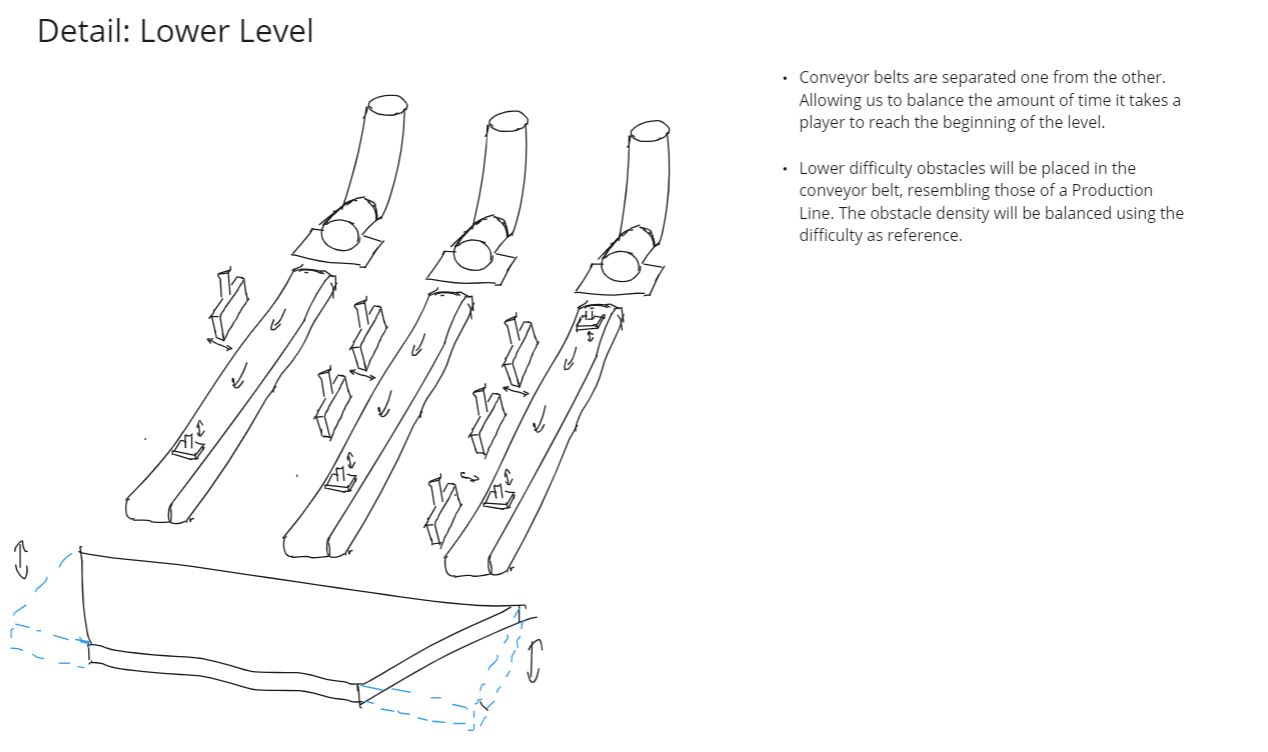
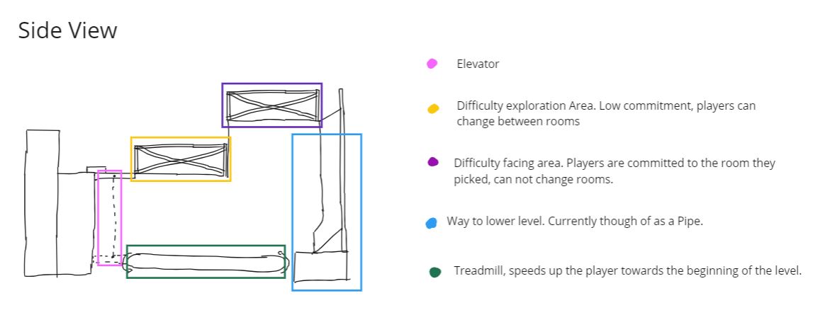
Once the players reached said Banks the Money would be awarded to them, and they would be sent back to the beginning. Initial plan was for the players to be sent back to the beginning via a Lower Level track in the level, as it can be seen on the paper design, however due to scope concerns this was removed from the level.
After an initial prototype and internal playtest one thing was clear, the concept was not properly messaged and way too confusing. This, in addition of the poor reception for another Collection Level we released during this time, made me take the decision to raise to the Game Director that it would be best to scrap this concept and move forward with a normal race level, with the objective to keep the level in-line with departmental objectives.
The change was proactively consulted upon with multiple team members including the Game Director himself, communicating the concerns of the initial concept and the basics of the new one to receive feedback on the reasoning and outcome of the decision. This decision directly impacted the product being developed by the team, both in quality and cost. Aware of its impact, which included having to delete work already done to prototype and loosing a chunk of development time, the new concept had a lower scope than the original.
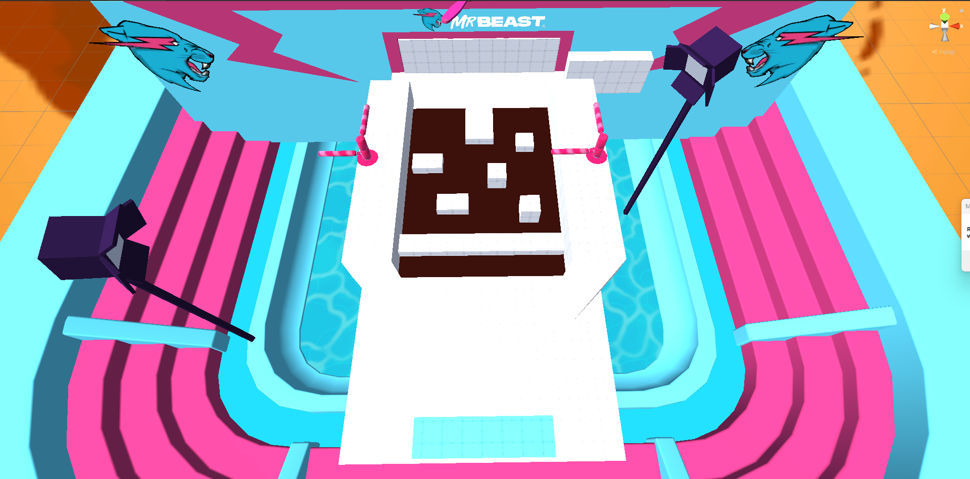
Below, you will be able to see the progress in development from initial blockout to finished product of the level.

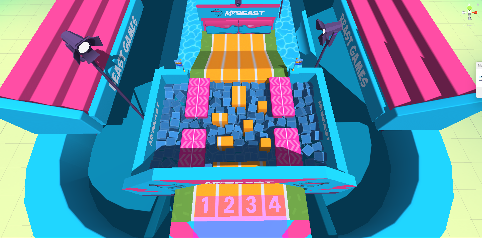
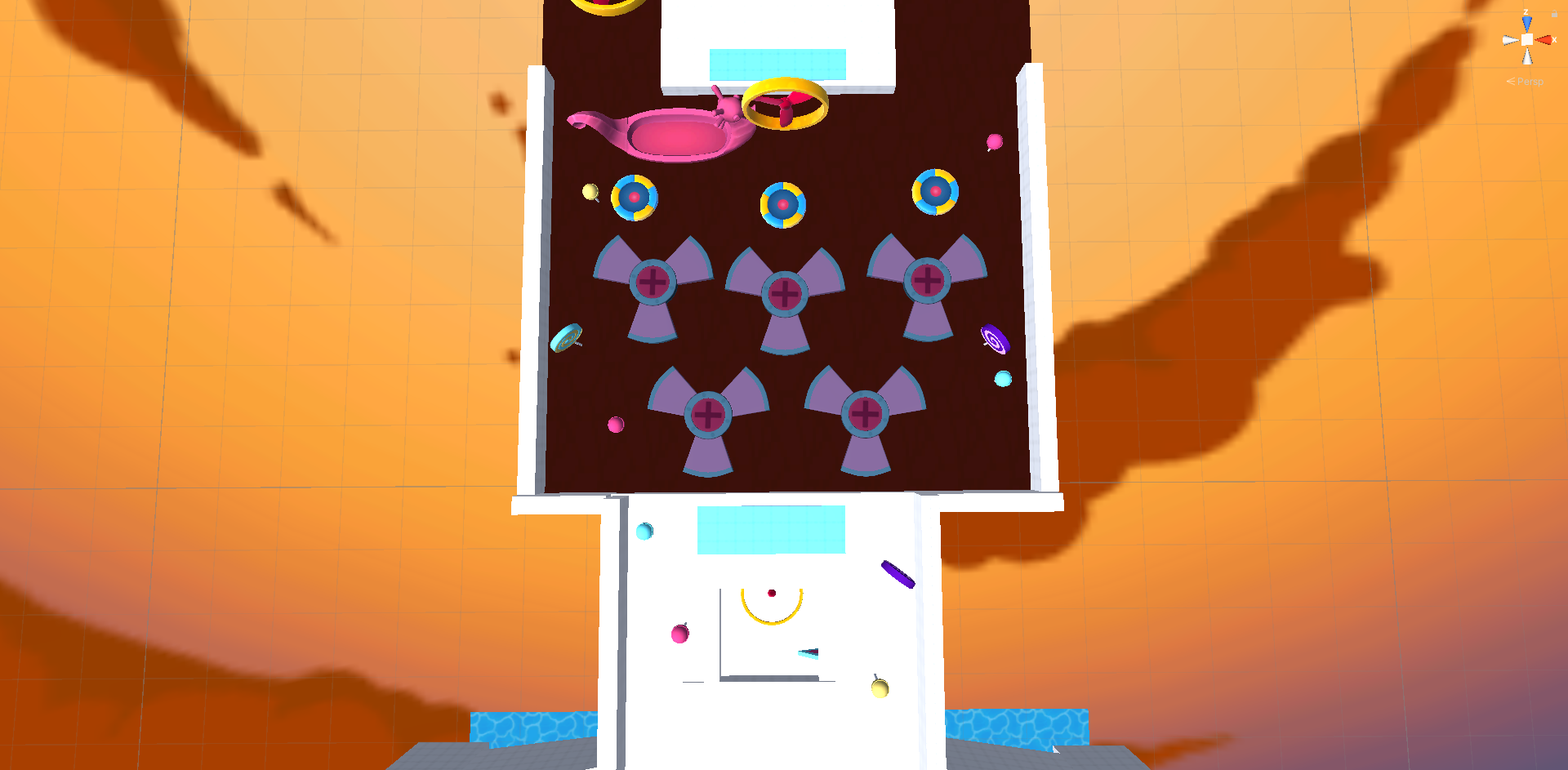
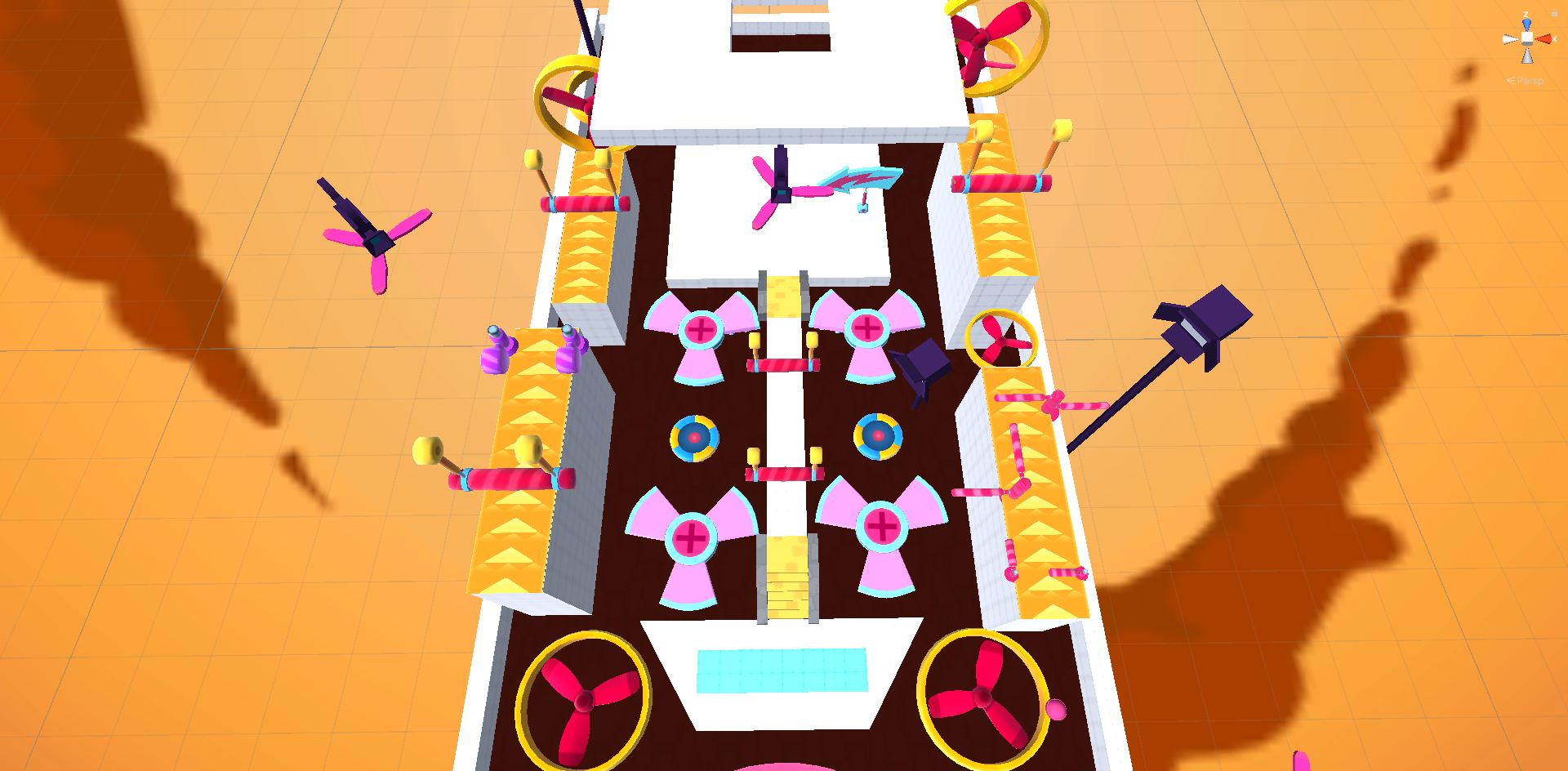
The first area was divided into two paths, a platforming area straight in the center for the daredevils and two easier paths on the sides of that area. The main objective was to divide the players into skills, maintaining the more skilled players in the center, making them feel seen.
The main changes that this area saw during development were mainly focused on the side paths. On the first iteration they were deemed to difficult, rolling back the difficulty into a single obstacle, which made the paths both quite dull and faster than the harder path. To combat this, the path was changed into two seesaws that tilted to the sides as soon as someone stepped on them off-center. This tilt would throw players into the mud underneath.
The main objective with this obstacle, was to take advantage of the chaos of the beginningg of each level to turn a otherwise dull obstacle, into an obstacle that heavily depended on player interaction.
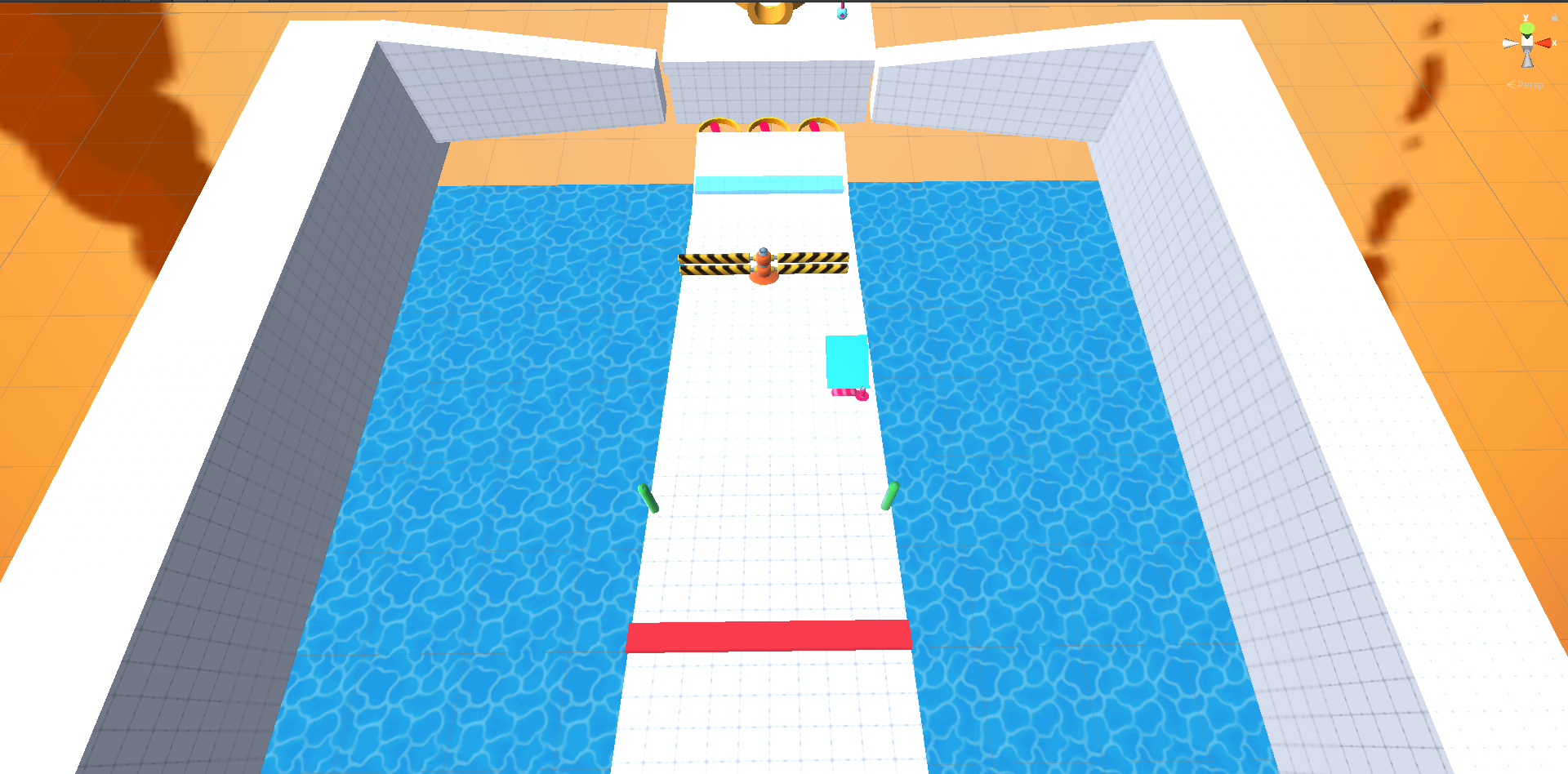
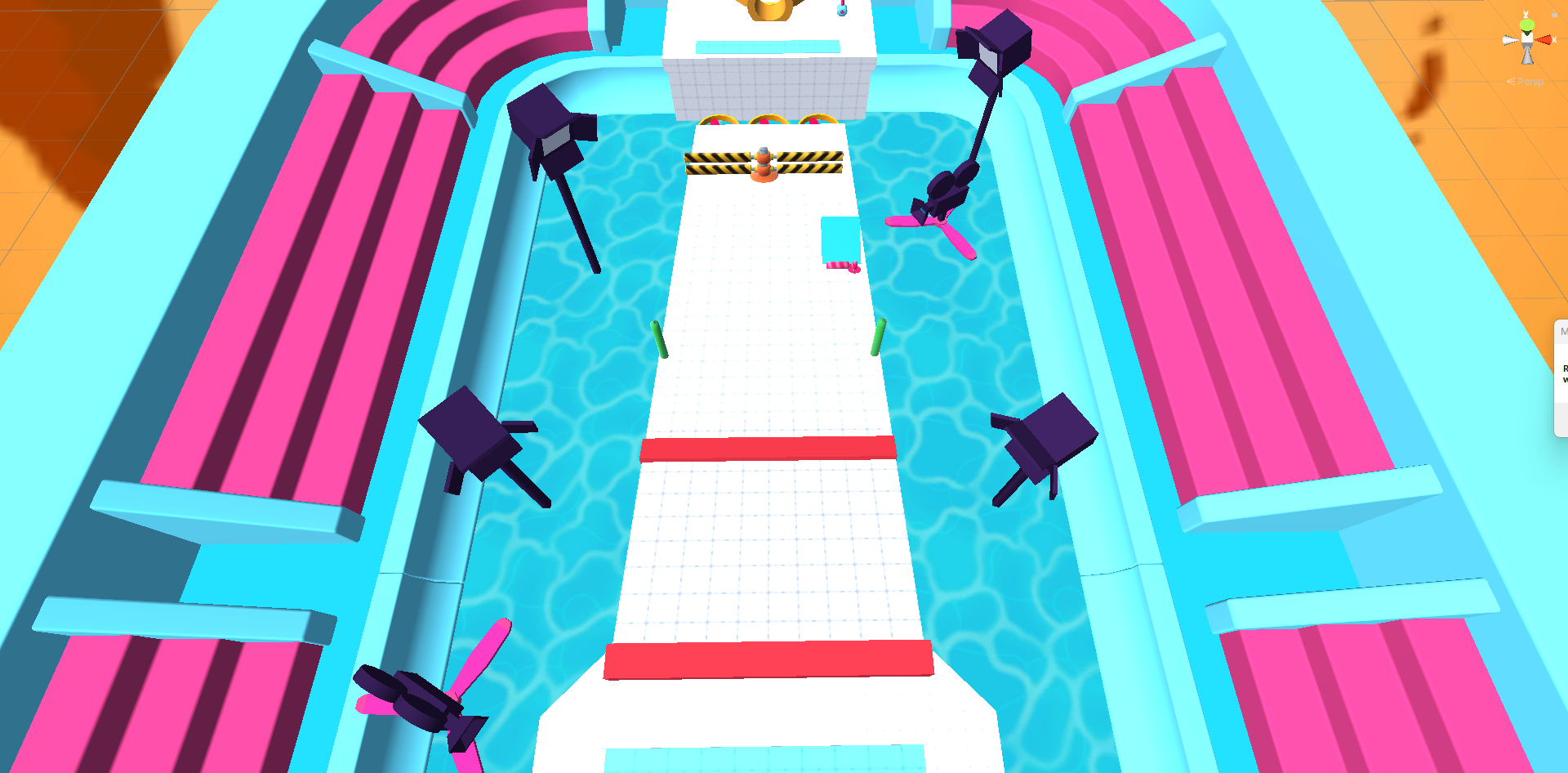
The second area was a big slide with multiple obstacles that the players would have to dodge on the go without having the ability to stop their movement.
This area largely remained unchanged, as it proved to be optimal from the first blockout on in internal playtests.
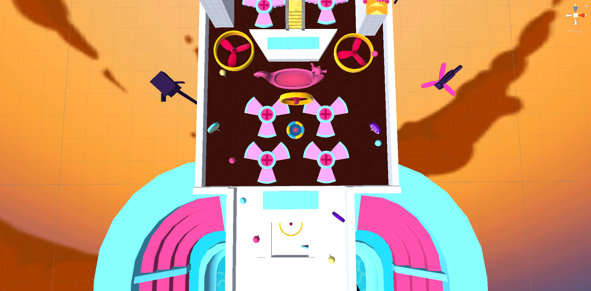
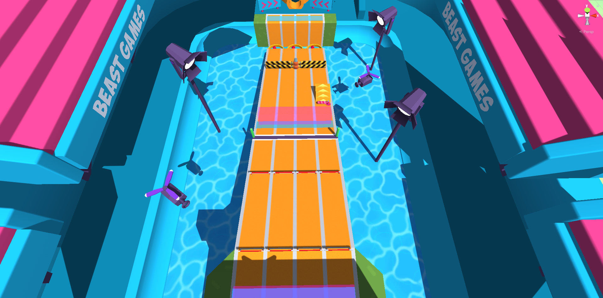
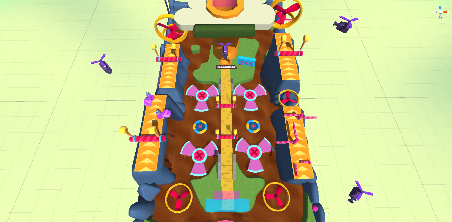
The third area is composed by spinning fan blades that would fall on a pattern, with a shortcut on the middle that would require precission jumping to take.
During internal playtests, this area proved to be too long and had to be shortened. I achieved this by cutting the amount of jumps needed to cross the area by 1. However small this reduction may look, it made quite an impact on play time because this extra jump meant one more chance at dying in this obstacle, which spawned you at the nearest safepoint which is at the beginning of the area.
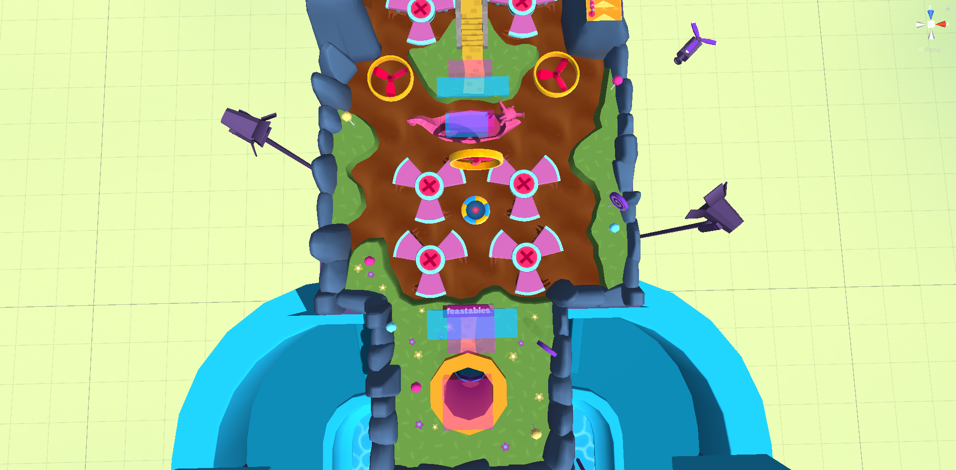
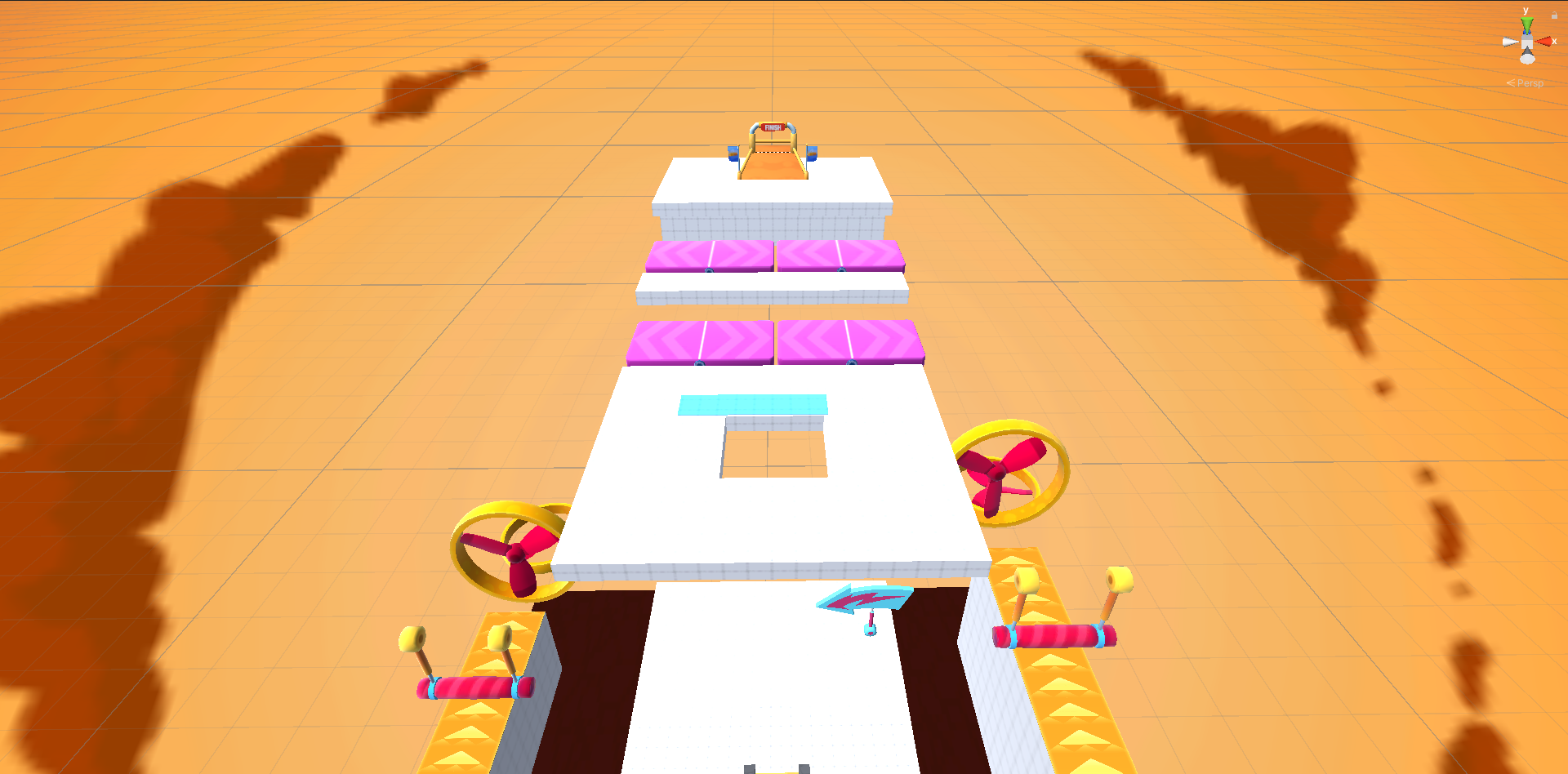
The Fourth are is composed by 5 paths. On the extremes, we see the two shortcuts that would allow you to get to the final area directly, essentially skipping the elevator to get up there. Then, in the middle we see a harder, yet faster, straight path that leads into the elevetor. Surrounding this path then, we see the two easier but slower paths meant for less skilled players, which also worked as a safe net for those taking the middle path or the extreme shortcuts.
This area was faced with a problem we have seen before in the First Area, the shorter but longer paths were not actually longer. This essentially made the high risk high reward path in the middle useless. To fix this, I doubled the amount of jumps required to complete the easier path, whilst also including a trampoline which increases the airtime while jumping. To accomodatte for this addittions the middle path had to be slightly extended, but as the nature of the obstacles of this path allowed you to be able to complete it without stopping your movement, this did not affect the completion time of the path as much.
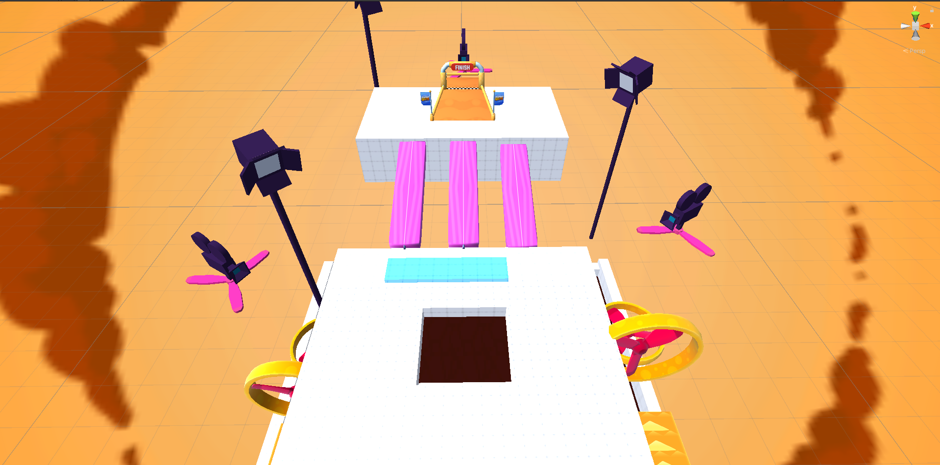

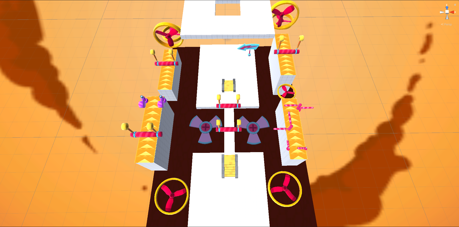
This area initially had a final obstacle to give one final chance for player to mess up and loose their spot as the leader, but as we will see these did not work quite as I expected.
The obstacles I used in this area were Seesaws, like the ones we saw in the start area. However the nature of a race makes it so you can't guarantee the amount of people that will be at the final area at one point in time, and these obstacles heavily rely in player interaction to be effective.
Initially I tried tackling the problem by reducing the width of the seesaws, forcing the player to have to walk dead center to not loose balance but even with this change, during the playtests we saw that without player interaction these were hardly an obstacle. This focus on player interaction, made me realize this obstacle would be a great addition to the very beginning of the level, where we can guarantee that the players will converge. This is why we see this obstacle be added to the Start Area on the Third Picture.
As a Designer in Stumble Guys, I was bestowed with the responsability of Mentoring the less experienced designers that had just joined the project.
During this process, I provided both onboarding onto the project and best practices, as well as provide insight, feedback and direction on my mentee's designs.
As the design owner in the MrBeast Levels, I was charged with the direct communication between our Levels Team in Stumble Guys and their creative team. The main focus was to discuss ideas of what could work and align best with their brand inside our game, as well as adapt their extravaggant ideas into a working concept within a videogame.